
The Consent Screen Is the Homepage
Before the campaign, before the type you paid a foundry for — there is a wall. That wall is the first sentence of the brand.

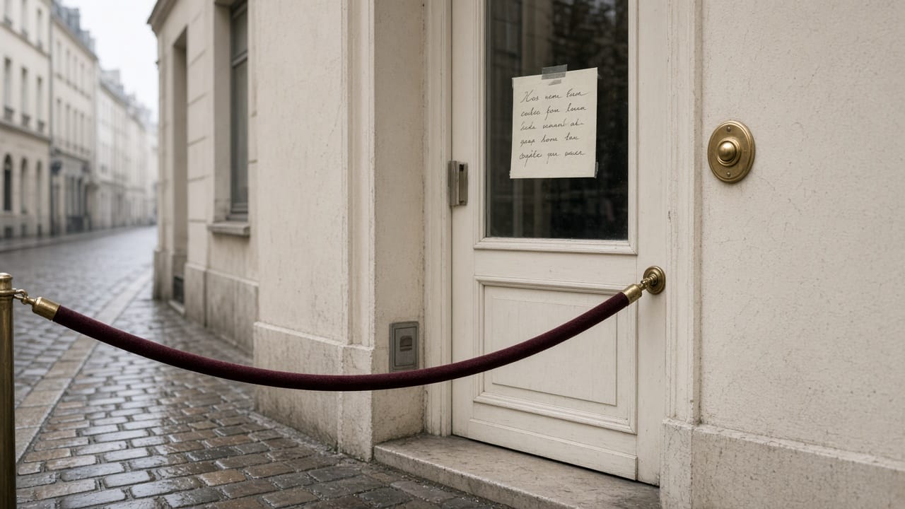
Before the campaign, before the product, before the type you paid a foundry for
there is a wall. Most of the wall is designed to be agreed with, not read. That is not a cookie problem. It is the first sentence of the brand.
A visitor arrives.
You interrupt them.
The interruption is legal.
The shape of the interruption is a choice. You can make the first human moment of the site a clear question, or you can make it a dark pattern with a lawyer's signature.
Researchers already measured which one you picked.
What the study actually found
Nouwens, Liccardi, Veale, Karger, Kagal — CHI 2020, Dark Patterns after the GDPR: 11.8% of the cookie notices they studied met a minimal set of GDPR requirements.
Removing the opt-out button from the first screen lifted implied consent by 22–23 percentage points.
A default "yes" on the boxes added 23 percentage points.
The paper is on ACM as well as arXiv.
The date is 2020.
The banners have not become more honest.
They have become more decorated.
noyb's 2024 cookie report found 89% of banners still used at least one design that pushed acceptance — and that was after years of complaints and a supposed clean-up.
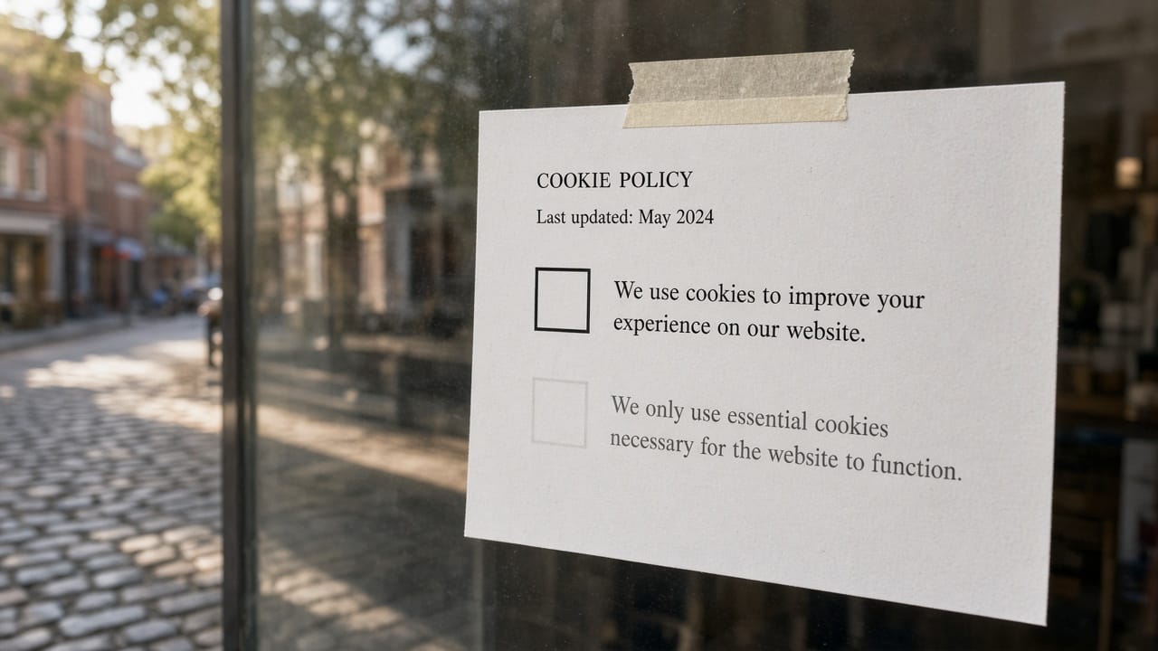
If your banner has a bright Accept and a grey "manage," you are in that percentage whether your counsel is comfortable or not.
Why this is a homepage problem
The consent screen is the first layout.
It sets the type scale, the contrast, the idea of whether this house explains itself.
A visitor who has just been nudged cannot be expected to believe the product page that follows.
You taught them, in one modal, that the store prefers a yes.
Baymard records 19% of consumers abandoning a cart because they did not trust the site with card data.
Trust is not born at the card field.
It is born at the first time you asked for something and handled the answer.
What a grown-up wall looks like
Reject as easy as accept, on the first screen.
No pre-ticked boxes.
Language a person can finish.
Not 28 vendors on a second layer as the only path to "no."
A design that matches the site, so the wall is part of the room, not a third-party sticker.
This is not legal advice.
It is the same craft we apply to empty states and accessibility: the first thing you show is the product.

How we think about it at BuonaLabs
We will not build a banner that hides the no.
If a measurement plan requires it, the plan is wrong.
The store can live without a dozen tags.
It cannot live as a first impression of bad faith.
The consent screen is the homepage.
Write it like you will stand next to it.
Sources
https://arxiv.org/abs/2001.02479
https://doi.org/10.1145/3313831.3376321
https://noyb.eu/en/new-study-cookie-banner-manipulation-more-common-ever
https://baymard.com/lists/cart-abandonment-rate
BuonaLabs is a digital innovation studio in Lübeck, Germany, building product pages, digital twins, and commerce experiences that try to tell the truth about the object. If this is the work you are trying to do, let's talk.