
Accessibility Is a Conversion Feature
Contrast is not a kindness you add at the end. It is whether a price can be read and a checkout finished.

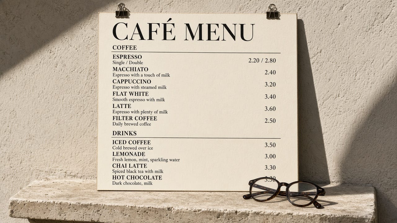
Contrast is not a kindness you add at the end.
It is whether a price can be read, a button can be found, a checkout can be finished.
Most of the web fails this in the first measurement.
That failure is not aesthetic.
It is lost trade.
The European Accessibility Act applied from 28 June 2025.
Directive (EU) 2019/882 is not a mood board.
It is law for a long list of digital services sold in the Union.
If you only started caring because of the date, you were already late for the customer who could not use the site in 2022.
But skip the legal threat for a moment.
Look at what the pages actually do.
The Million, again
WebAIM's Million (26 Mar 2025) analyzed the home pages of the top million sites.
94.8% had detectable WCAG 2 failures.
That is slightly worse than 2024.
The average page had 51 errors.
79.1% of pages had low-contrast text.
54.7% had missing alternative text on images.
46.1% had missing form labels.
45.0% had empty links.
These are not edge cases.
They are the default construction of the commercial web: grey type on grey, icons with no name, inputs that a screen reader cannot introduce.
A low-contrast price is not a style.
It is a price that does not exist for a large part of the room.
A form without a label is a checkout that cannot be completed without sight and a mouse.
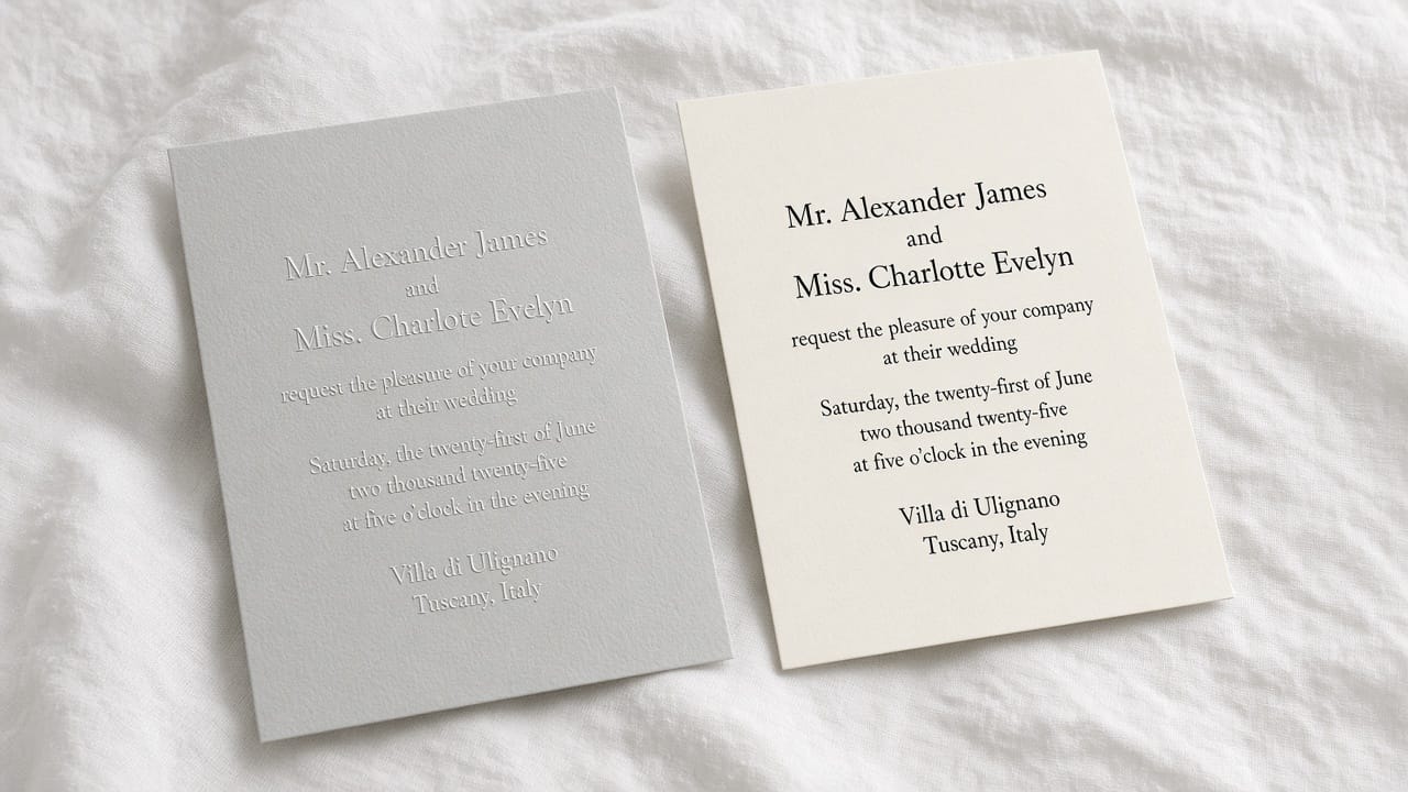
Who you are excluding, in numbers
You do not need a special-interest story.
You need the home page.
If almost nineteen in twenty sites fail automated checks — and automated checks only catch a subset — then "we will do accessibility later" means "we will ship a store a machine can already prove is broken."
The conversion argument is the same as the empty state argument and the weight argument.
You cannot buy what you cannot perceive.
You cannot perceive what the design hid.
What to fix first, without theatre
Contrast, on actual type, in the actual brand palette — not on a slide.
Names for every control a keyboard or a reader will meet.
Labels on every field that asks for money or an address.
Focus that can be seen.
Images that say what they are if they carry information, and stay silent if they do not.
None of this requires a new aesthetic.
It requires refusing the pale-on-pale luxury template that photographs well and reads poorly.
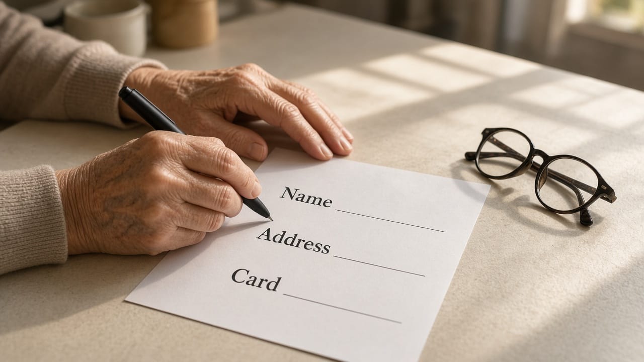
How we think about it at BuonaLabs
We treat WCAG as a specification, like a bottle's fill line.
The Act is the floor in Europe.
The customer who cannot read the serum volume is the reason.
Accessible is not a badge.
It is whether the store works.
Sources
https://webaim.org/projects/million/
https://eur-lex.europa.eu/eli/dir/2019/882/oj
BuonaLabs is a digital innovation studio in Lübeck, Germany, building product pages, digital twins, and commerce experiences that try to tell the truth about the object. If this is the work you are trying to do, let's talk.