
The Empty State Is the Product
Most stores are designed for the full cart. Most sessions are an absence. That absence is doing the selling.

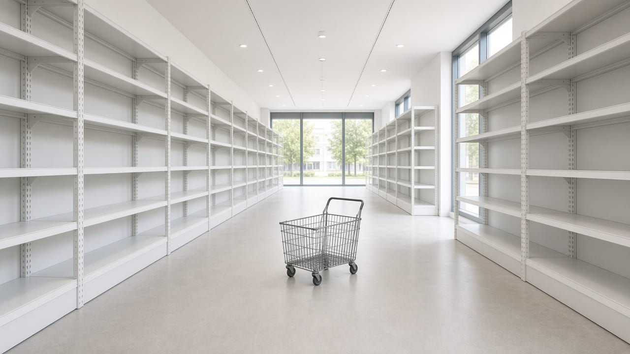
Most stores are designed for the full cart, the rich result, the returning customer with a history. Most sessions are none of those things. The first thing a stranger sees is an absence
and that absence is doing the selling, or the refusing.
Open your own site in a private window.
No recommendations.
No "buy it again." Search for a word you do not sell.
Apply a filter that returns nothing.
Arrive from an ad to a size that is gone.
That is the product.
Not the campaign.
The blank.
Search is where the store admits what it is
Baymard's large-scale checkout research puts average cart abandonment at 70.22% across 51 studies (updated 1 Jan 2026).
Extra friction at the end of a journey is well documented. Less fashionable: the journey that never starts because search could not interpret the query.
In Baymard's product-finding research (9 Apr 2025), 22% of sites still fail to handle even slightly misspelled queries.
A customer who types what they mean, almost, is told the shelf is empty.
It isn't.
The index is.
An empty result that says "0 products" and offers a blank search box again is not honesty.
It is a closed door with no note. An empty result that says we don't have this, here is the nearest thing, here is how to ask is a clerk who stayed on the floor.
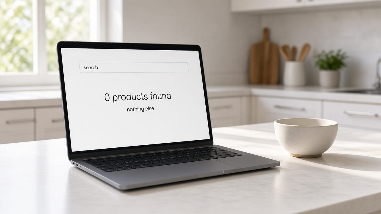
Zero is a design problem, not a data problem
Empty states get designed last because they feel like error pages.
They are not.
They are the most common pages a new customer will see:
- A wishlist with nothing in it.
- A cart after a session timeout.
- A filter combination that the catalog cannot satisfy.
- A sold-out variant that the ad still promotes.
Each of those can be a dead end or a conversation.
The difference is whether you planned for absence.
Baymard also notes that 24% of consumers have abandoned because the site was too slow, and 19% because they did not trust the site with card data.
Those are empty-adjacent: the cart was full, the confidence was not.
The blank they left with was yours.
What a useful empty looks like
It names the miss.
It offers a next step that is not "try again." It does not pretend the catalog is infinite.
It does not dump the entire range as a consolation prize.
For search: corrected query, nearest category, a way to request the missing thing.
For a sold-out size: the truth, a wait-list, the next size that exists — not a ghost add-to-cart.
For a new account: a first useful action, not a dashboard of zeros.
The empty state is where you show whether the store has a mind, or only a feed.
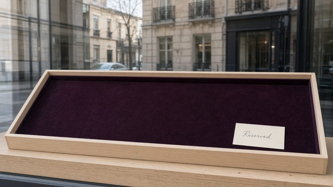
How we think about it at BuonaLabs
We design the zero before the grid.
If the miss cannot be explained in a sentence, the taxonomy is wrong.
If the sold-out page cannot do anything but apologize, the inventory is a secret.
Absence is part of the product.
Treat it like one.
Sources
https://baymard.com/lists/cart-abandonment-rate
https://baymard.com/blog/ecommerce-search-query-types
BuonaLabs is a digital innovation studio in Lübeck, Germany, building product pages, digital twins, and commerce experiences that try to tell the truth about the object. If this is the work you are trying to do, let's talk.