
Color Is a Claim
A shade is not a mood. It is a specification — of light, of undertone, of what the product will do on a real face.

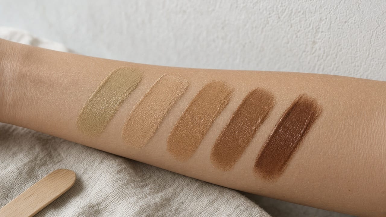
A shade is not a mood. It is a specification
of light, of undertone, of what the product will do on a real face. Most beauty sites treat it as poetry. That is why the box keeps coming back.
Foundation is the only product in the catalog that has to disappear.
If it does, nobody writes a review.
If it doesn't — if it turns pink at the jaw, grey in daylight, orange by dinner — the customer does not debate your brand story.
They open a return.
That is not a preference.
It is a failed claim.
The page said this is your color.
The face said otherwise.
The range that isn't a range
Count the shades on a product page and you will feel industrious.
Forty.
Fifty.
A slider.
A grid of circles that all look, on a phone, like adjacent beiges.
The count is the wrong metric.
Google's Monk Skin Tone scale — ten tones, built with sociologist Ellis Monk — exists because the old Fitzpatrick scale was a dermatology tool, not a map of how people actually look.
A range that clusters in the middle and skips the ends is not inclusive.
It is a mid-tone catalog with extra SKUs.
Pantone's 2023 SkinTone Guide added 28 shades to reach 138, specifically more deep tones and yellow undertones, because customers could not find themselves in the previous set.
That is a color-science problem wearing a merchandising costume.
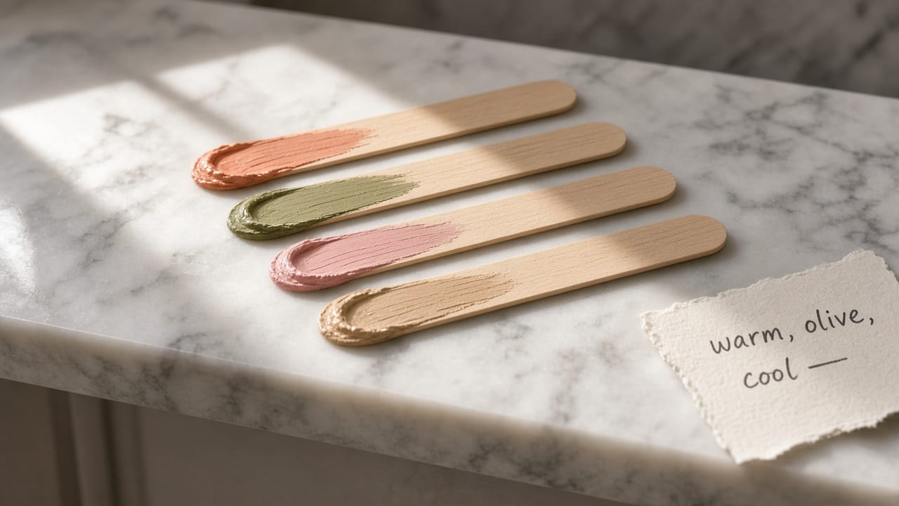
If your grid cannot distinguish warm from olive from neutral at the same depth, you do not have forty shades.
You have twelve shades photographed forty times.
Light is the other ingredient
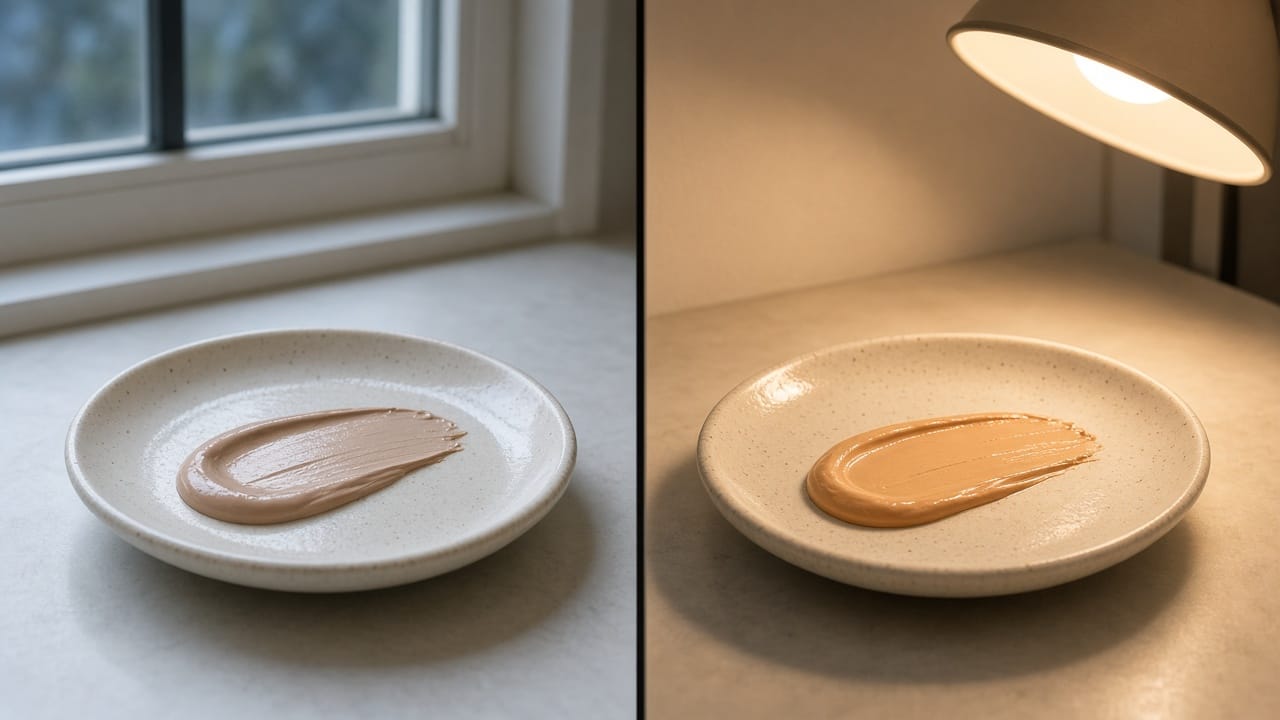
A shade that matches in a store's fluorescent bay will fail in a kitchen at 8am.
A shade that matches a retouched campaign still will fail on a phone in the street.
Color is not a hex value.
It is a hex value under a light.
This is why the hero image is a legal-feeling document even when no lawyer wrote it.
You asserted a match.
You asserted it in a light the customer does not live in.
Then you asked them to pay for the experiment.
Virtual try-on only helps if the mapping is to undertone and depth, not to a flattering average of the last thousand faces.
A filter that makes everyone look slightly more like the campaign is not a try-on.
It is another claim.
What the page owes the face
A color page that tells the truth does a few unglamorous things:
- Names undertone in words a human uses — warm, cool, olive, neutral — not in a proprietary poetry.
- Shows the same shade in more than one light, on more than one depth, without retouching the mismatch away.
- Lets someone try it on their face, in their room, before they pay.
- Treats a return reason of "wrong shade" as a ticket against the grid, not against the customer.
None of that is a guarantee of a match.
Skin and seasons move.
It is a refusal to pretend that a circle on a white background is a face.
How we think about it at BuonaLabs
We treat complexion as a materials problem.
The digital twin of a shade has to survive daylight, not just the studio.
The try-on has to map to a scale a chemist would recognise.
The page has to be willing to say what the shade is not.
Color is a claim.
Write it like one.
Sources
https://skintone.google/get-started
https://www.pantone.com/articles/product-spotlight/introducing-the-2023-pantone-skintone-guide/
https://www.dhl.com/global-en/microsites/ec/ecommerce-insights/insights/e-commerce-logistics/2025-returns-trends.html
BuonaLabs is a digital innovation studio in Lübeck, Germany, building product pages, digital twins, and commerce experiences that try to tell the truth about the object. If this is the work you are trying to do, let's talk.