The Sea of Sameness
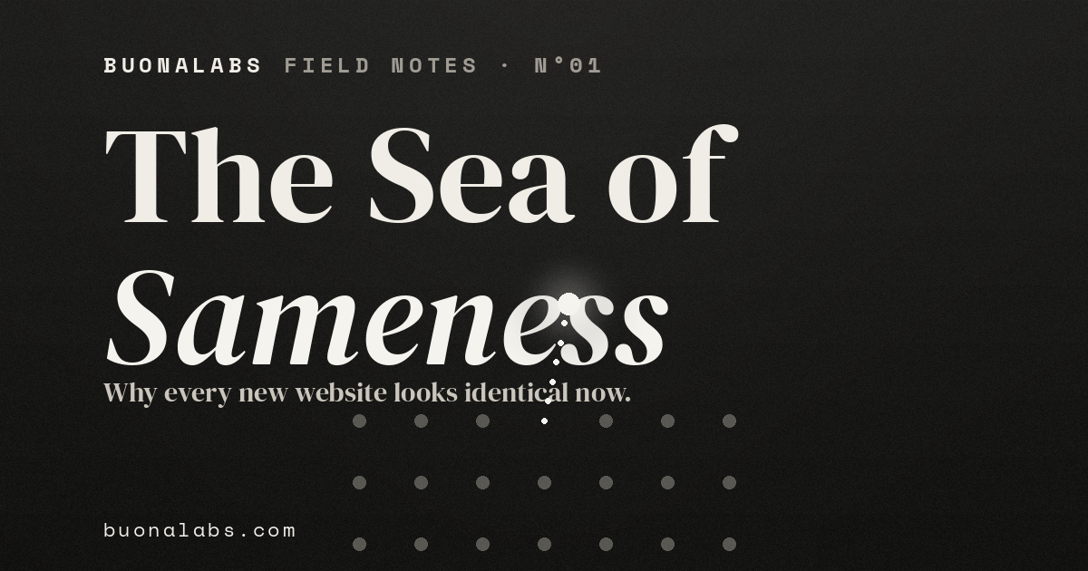
Every new website looks identical now.
It isn't your imagination — it's a feedback loop, it has an origin story, and for a brand it's the most expensive mistake on the web.
Try this:
Open the websites of five companies in your industry, side by side, and squint until the text blurs out.
A full-bleed hero with an oversized headline. A logo set in a clean sans-serif.
Three feature cards below the fold. A soft gradient bleeding through the background.
A "trusted by" wall of grey logos. A testimonial slider.
A footer with the same four columns.
Now tell me, without un-squinting, which one is which.
You can't. Neither can we.
And the uncomfortable part is that this isn't a coincidence, a coincidence of taste, or a phase that will quietly pass.
The visual web has been collapsing toward a single look for over a decade, and in the last two years that collapse went from a slow drift to a free fall.
Here is exactly how it happened — and why, if your site is one of the indistinguishable ones, it's costing you money you'll never see leave the building.
First, the proof that it's real
This is not nostalgia talking.
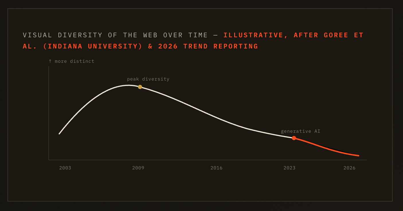
Researchers at Indiana University ran the question through a machine instead of a memory, comparing the visual design of websites across the history of the web — more than two million pairwise comparisons in total.
Their finding was unambiguous: sites were at their most visually different from one another around 2008 to 2010, and have been converging ever since.
Layout diversity in particular fell off a cliff.
The cause wasn't that the world suddenly had less to say.
It was tooling.
The team traced the homogenization directly to a shrinking, shared set of frameworks and component libraries.
The logic is brutally simple: when most of the web is assembled from the same handful of kits, most of the web arrives at the same handful of shapes.
Build every house from the same flat-pack and you get the same house, painted five colours.
That was the before picture.
Then two things happened that turned a trend into a tidal wave.
The origin story nobody likes to admit
The first is a story so on-the-nose it's almost funny.
In August 2025, Adam Wathan — the creator of Tailwind CSS, the styling framework that an enormous slice of the modern web is built on — posted a half-joking public apology that racked up over a million views.
The gist: years earlier, he'd made the default button colour in Tailwind's UI library a specific shade of indigo.
One hex value.
It got copied into tutorials, starter templates, open-source projects, and community snippets for half a decade.
And then all of that became training data.
So today, ask almost any AI tool to generate an interface and there's a good chance it reaches, by reflex, for that same indigo — and the same purple-leaning gradient that goes with it.
A single default choice, made once, propagated into the aesthetic DNA of the entire generated web.
The internet, in a very literal sense, now has a default colour.
Most people just never chose it.
Then AI ate the web — and threw it back up
That's the second thing, and it's the accelerant.
Designers have adopted generative AI fast and for good reason.
Figma's State of the Designer 2026 report found that 72% of designers now use generative AI in their workflow, and 91% say it improves the quality of their output, not merely the speed.
As a productivity story, that's enormous.
But look at the mechanism.
These models are trained on the existing web — the same web the Indiana study already measured as homogenized.
So they don't pull toward originality.
By construction, they pull toward the average.
Feed the mean back into a generator and you get the mean back out, a little smoother each time.
It's a feedback loop: the homogenized web trains the AI, the AI generates more homogenized web, that gets indexed and becomes training data for the next round.
You can watch it happen in real time.
A widely shared 2025 experiment handed the same prompt to three popular AI site builders.
Three nearly identical layouts came back — same soft palette, same centred hero, same weightless fade-in animations that signify nothing.
Designers have given the result two names that have stuck: "Algorithmic Beige" for the soft, pastel, sans-serif blandness of it, and the blunter "AI slop," a label that went viral after a design lead at a major startup accelerator reviewed real founder websites on a podcast and pointed out that most of them had let the machine make every single visual decision.
The sites looked, in his words, like a template-driven afterthought.
That's the tell. Not that AI was used — that nothing was chosen.
The Linear effect
The most fashionable version of sameness in 2026 doesn't even look beige.
It looks expensive.
A few years ago the project tool Linear shipped a website so polished — dark backgrounds, glassmorphic panels, subtle gradients, restrained motion — that it set a new bar.
It was, and is, genuinely beautiful work.
The problem is what came next. Everyone got a little too inspired.
There is now an entire gallery of sites — collected, only half-jokingly, under names like linears.art — that all wear the same dark, glassy, gradient-lit uniform.
Run the squint test on four of them and you genuinely cannot tell them apart.
Even Linear's own founders have hinted they're ready to move on, because the look they invented stopped being a signature the moment it became a template.
Here's the thing worth sitting with.
Stripe doesn't look like Notion.
Notion doesn't look like Linear.
Each of those brands made deliberate, sometimes risky choices — and that is precisely why you can picture each of them right now without opening a tab.
The companies you remember are the ones that decided, on purpose, to look like no one else.
Memorability isn't an accident of budget. It's a consequence of choosing.
This is a business problem wearing a design costume
It's tempting to file all of this under aesthetics — a thing for designers to fuss over, not founders. That's the expensive mistake.
Stanford's long-running research on credibility found that roughly three quarters of a visitor's judgment about whether they trust you is formed by visual design alone.
Your website is, functionally, the first employee a prospect ever meets.
Now imagine that employee is wearing the exact same outfit as the people at your two nearest competitors.
What reason, exactly, have you given anyone to pick you?
A site that blends in doesn't quietly read as "professional and safe."
It reads as generic, mass-produced, interchangeable — and that impression transfers straight onto the brand standing behind it.
There's research describing the next stage as "predictable blindness": when a layout matches the thousand others a person has already scrolled past, the eye stops engaging and the page becomes, effectively, invisible.
You paid for traffic that arrives and sees nothing.
And there's a sharper signal underneath.
When your site looks like a template, it tells every visitor — below the level of conscious thought — that you didn't make deliberate choices here.
Which raises a quiet, damaging question in their mind: if you outsourced this decision, what else did you outsource?
In a market where everyone is fighting for a sliver of trust, looking like everyone else isn't a neutral, low-risk position. It is the single worst one to occupy.
The good news: the pendulum is already swinging back
Here's the encouraging part.
The studios paying attention have read the same signals and are sprinting in the opposite direction.
The leading edge of 2026 design is deliberately raw — neubrutalism, tactile textures, aggressive contrast, sharp geometric forms, layouts that openly refuse the template.
Toggl, to pick one example, leaned into a brutalist site with playable mini-games. The point of all that visible roughness is exactly that it's visibly made — when everything around you is smooth and machine-perfect, evidence of a human hand becomes the rarest signal of all.
A serious caveat, because this is where a lot of brands hurt themselves: raw is not a universal solvent.
Neubrutalism and unfinished aesthetics work brilliantly for creative agencies, fashion, and bold consumer tech.
They actively damage trust in financial services, healthcare, and enterprise B2B, where a degree of polish is the message.
Distinctiveness doesn't mean loud.
It means chosen, and chosen to fit who you actually are.
Underneath the surface, the engineering is moving the other way on purpose: leaner code, faster loads, performance designed in from the first line.
(Some teams are even adding a small but very 2026 touch — a component that lets a visitor pull an AI summary of your value proposition straight into ChatGPT, Claude, or Perplexity, designing for the machines that now read your site as much as the humans who do.)
The throughline is the same: standing out is quietly becoming the new baseline for quality, not a luxury on top of it.
How we think about it at BuonaLabs
We're not romantics, and we're emphatically not anti-AI.
We use these tools every day; they're extraordinary, and pretending otherwise would be its own kind of trash.
The mistake was never using AI.
The mistake is letting it make the decisions that are supposed to carry your story.
So we treat AI as a power tool, not the architect.
Our process starts where the templates structurally can't: with the specific, unrepeatable thing that makes you unlike anyone else in your category — and only then do we reach for the fast tools to ship it, fast and lean.
Because a brand assembled from the average of every other brand is, by definition, average.
A website exists to tell your story, not the statistical mean of everyone's.
There's a test we keep coming back to, and you can run it on your own site this afternoon:
If your homepage could be swapped with a competitor's and nobody would notice — that isn't a small problem. That's the whole problem!
The web is regressing toward a mean, and the gravity is only getting stronger as the feedback loop tightens.
The brands that win the next few years will be the ones that refuse to dissolve into it — the ones that decide, deliberately, to look like no one else.
If you squinted at your own site a few paragraphs ago and felt a flicker of recognition, that flicker is worth more than a redesign budget.
It's the moment you noticed you'd disappeared.
The next move is to come back.